The updated localised regression chart suggests that two-party preferred voting intention for Labour continues to decline.

However, this decline is not as marked on the Bayesian Gaussian Random Walk (GRW) model. This model assumes that:
- how the whole population will vote on any given day is very similar to the day before (this is the Gaussian Random Walk in the model)
- opinion polls provide an irregular and noisy indication of how people would vote; and
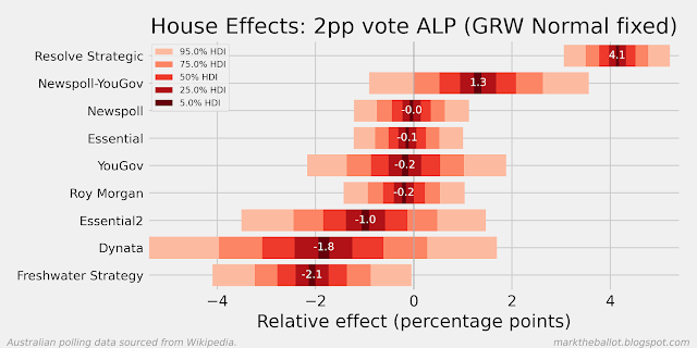
- the individual pollsters have unintended methodological biases that tend to favour one party over another over time. For the purposes of the model, these house effects are assumed to cancel each other out across all pollsters, ie. they sum to zero across all of the polling houses.

The Gaussian Process (GP) model, has a similar approach to identifying and managing house-effects as the Gaussian Random Walk, but it models voting intention using a covariance matrix, with a higher covariance for polls that are closer together in time. The covariance function I used is the exponentiated quadratic kernel (with a length scale of 50 - "ell" in the denominator). This model produces a similar aggregation result, although it suggests that the recent poll movement away from Labor is less intense.


Collectively, the central tendency of these models can be seen in the following chart. The following chart also includes a left-anchored series (labeled GRWLA) which is a Gaussian Random Walk that has been left-anchored to the election result at the previous election. The house effects in the the GRWLA model do not sum to zero.

Turning to primary votes. The most significant trend is Labor's decline. The Coalition is up on where it was six months ago (but may be in decline at the moment). The Greens may be up on where they were six months ago. The vote for others and independents also looks up.


The data for these charts is sourced from Wikipedia. Before analysis, the polling data is treated to ensure that:
- undecided respondents are proportionately allocated where necessary, and
- the two-party preferred and primary votes are normalised to sum to 100 per cent exactly.
No comments:
Post a Comment