Showing posts with label 2010 Federal Election. Show all posts

Sunday, May 19, 2019

A polling failure and a betting failure

Well, that went bad for the pollsters. Every poll published during the election campaign got it wrong. Collectively the polls suggested Labor would win around 51.5 per cent of the two-party preferred vote; at this stage in the count, it looks more like 49 per cent for Labor to the Coalition's 51 per cent.

I am as surprised as most. While it was obvious that the pollsters were doing something that reduced polling noise (and hopefully increased the polling signal), I assumed they knew what they were doing. What I really wanted was for the pollsters to tell us (the consumers of their information) how it was made: because it ain't what it says on the tin.

The 16 published polls since the commencement of the election campaign did not have the numerical features a statistician would expect from independent, representative and randomly sampled opinion polls. They did not look normally distributed around a population mean (even one that may have been moving over time). In short, the polls were under-dispersed.

I was troubled by the under-dispersion in the polls (here, here, and here), and I knew this could increase the risk of a polling failure. But I was not expecting a massive failure as such. Consistent with the polls, I thought the most likely outcome was a Labor victory in the order of 80 seats (plus or minus a few), with the Coalition to pick up around 65 and for others to land around 6 seats (80-65-6). The final result could end up being closer to 68-77-6. While a polling failure was possible, perhaps even 30 per cent likely, I did not think it the most likely outcome. Let's chalk it up to living in the Canberra bubble and confirmation bias.

I was also a little annoyed. The Bayesian aggregation technique I use makes the most use of the data at either end of the normal distribution around the population mean. Yet this data was implausibly missing on the public record. You don't need an aggregator when every poll result is in the range 48-49 to 51-52. There is nothing needing clarity on those results.

Because I assumed the pollsters were smoothing their own polls, I wondered what raw results they were actually seeing. Compared with February and March (Coalition on 47 per cent in round terms), the collective April and May poll results were substantially different (48.5 per cent). It is almost as if the public's mood shifted one and a half percentage points overnight with the 2 April Morrison Budget (and I am a long-standing sceptic about the capacity for Budgets to shift public opinion). To smooth so quickly to a substantially different number seemed unusual and analytically complicated. I wondered a number of times whether the pollsters had seen a 50 or a 51 or even a 52 for the Coalition in their raw data before smoothing (indeed, thinking about the missing inliers and outliers was how I got to being troubled by the polls).

What next: Something has to change. Like the United Kingdom, which had a similar scale polling failure with its 2015 general election, we need an inquiry into what went wrong. We also need way more transparency. Pollsters need to explain their methodology better and publish more on the pre-publication processing they undertake.

At least the myth of bookmakers knowing best has been put to bed. The bookmakers had a bad day too: especially Sportsbet, which had paid out early on a Labor win.

Postscript

Thanks to the Poll Bludger for the recognition. And some further reflections at Poll Bludger.

It is nice to see that my questioning of the under-dispersed in the polls means that I am now labelled a hardcore psephologist (albeit before the election).

The postmortem at freerangestats.info is worth reading.

A great election postmortem by Kevin Bonham.

The mathematics does not lie: why polling got the Australian election wrong, By Brian Schmidt.

Saturday, March 23, 2013

Recap: the last days of Kevin Rudd (2010)

With all the drama of this week, let's look at the polls in the six months prior to Kevin Rudd's removal from office on 24 June 2010. All of the data for that period is strongly suggestive that Rudd was recovering from his May 2010 slump. This recovery, between May 2010 and June 24 is most evident in the Bayesian aggregation for the period.


The June 2010 recovery is pretty easy to see in the raw data.


At the very least (after adjusting for collective house effects) it would appear that Keven Rudd was removed from office on that fateful morning in June 2010 on a poll winning 52 per cent of the two-party preferred vote. We know what happened next.


Update


Kevin in the comments below makes a valid point. The last few data points above slide into Julia's elevation bounce. I have changed the cut-off date from 24 June to 20 June and re-run the analyses. The key charts with this change follow.


I should point out that the observation count in the LOESS charts is the number of LOESS data points in the analysis. Where there are two polls on a date, only one point in the LOESS series is calculated.

Sunday, February 24, 2013

Yet another look at the 2010 Election

I have been thinking on how to calibrate the Bayesian aggregation to get a better understanding of the actual national two-party preferred (TPP) voting intention. At the moment, the model assumes the bias across all houses sums to zero. The model needs a constraint of some kind to work. My plan was to look at the house biases for past three or four elections and to plug a multi-election average of the biases into the model as the constraint. (Unfortunately I have been diverted from that task, and this blog post explains why).

I was also thinking about what to do with Essential, which appears under dispersed compared with what you would expect from statistical theory. Furthermore, its house effect over time is inconsistent with the effects from the other polling houses. Essential's house effect is much more variable relative to other pollsters over the long run. I would not be surprised if a lot of the behaviour we see with the Essential poll is a product of its two-stage sample frame.

Anyway, I decided to run the anchored Bayesian model for the 2010 election without Essential. The results (using 1 million iterations) were as follows. (I'd ask that you excuse the indulgence of two decimal places on the house effects chart, I know the last decimal place is mostly noise).


These results surprised me. They differed substantially to what I had seen before (replicated below with a 1,000,000 simulation run).


I asked myself, what is going on here? It was time to revisit the raw data. It was a close election and much closer than most pollsters suggested (with the final Newspoll and Essential getting the closest to predicting a hung parliament).


The data from the polling houses suggested very different election campaign stories. Nielsen and Galaxy paint the picture of a campaign that did not change much. The parties finished the campaign where they the started, albeit after dipping a bit in the middle.  The Essential story is one of the Coalition consistently closing the gap. Newspoll and Morgan phone also have a gap closing story, but with Labor recovering a bit before the election. Morgan phone sees the Labor recovery sustain, but Newspoll (like Essential) saw a further decline in the final week. I am not sure what to make of the Morgan F2F narrative.

These narratives can be highlighted with a short-run LOESS regression for each house.


There are a number possibilities that might explain the inconsistencies and wrinkles in and between the above charts.

There may have been a further decline in Labor's vote share in the last two days of the campaign that was not picked up by the polls. Personally, I am not convinced by this. 

I suspect the first Newspoll reading in the period was atypically high (compared with where Newspoll typically sits in house effect terms). Which means, I suspect the election was pretty close from at least month out (but before that it was more favourable for Labor with the Gillard honeymoon effect - discussed further below).

Another possibility, which I have still to explore, is that the TPP vote estimates based on preference flows in 2007 were unrealistic. 2007 was on of those turning point elections where there was a clear mood for change.  It may be that preference flows in 2010 were unusual, and my reliance on them for predicting 2013 is problematic.

A confounding factor is that Julia Gillard only replaced Kevin Rudd as Prime Minister on 24 June (less than a month before the election was announced on 17 July). The election was held in the post Gillard honeymoon period, and this may have affected some polling houses more than others. If we take a slightly longer time frame we can see the following, where it would appear that Essential and Morgan F2F were the most consistently honeymoon affected pollsters (although the Morgan phone poll had a bit of a blip there).


There is much to think about here.

Saturday, December 15, 2012

Lessons on pooling polls from the 2010 federal election

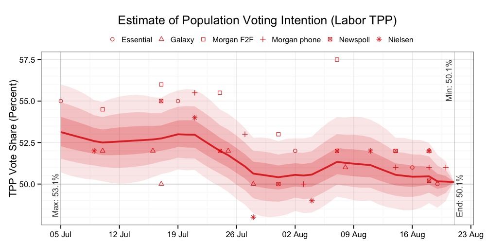
With thanks to the reader who sent me the Galaxy data in the lead-up to the 2010 election, I have re-run the earlier analysis of house effects and the likely pathway for population voting intention.


That final Galaxy poll (52-48 for Labor) is illustrative of the challenge when analysing individual polling statistics immediately prior to an election. The most likely population voting intention pathway (the red line in the above chart) is within the margin of error of (+/-) 3 per cent for the final Galaxy poll. The Galaxy poll was statistically accurate. You cannot ask for more from an individual poll.

However, as we know, the final outcome of 50.12 to 49.88 per cent in Labor's favour produced a hung parliament. If the outcome had been at the centre of the distribution implied in final Galaxy poll, it would have produced a sizable Labor win. The irony is that Galaxy's house effect over the period was slightly pro-Coalition.

If we re-run the above analysis (1) without anchoring the end-point to the election result and (2) if we introduce the constraint that the house effects will sum to zero we get the following plots.


These plots remind us that pooling the polls does not automatically result in an unbiased estimate of the population voting intention. There is no guarantee that house effects will cancel each other out. In this case, the pooled polls were out by 1 percentage point. In 2010 it turned out to be the difference between a hung parliament and a comfortable win for Labor.