For some time I have been running four related but different models of poll aggregation. The difference between the models can be mapped on a two-by-two frame:
| Use pollster published two-party preferred (TPP) Estimates | Use published Primary Vote Estimates and derive a TPP aggregation based on preference flows from the 2013 election | |
| Unanchored (House effects sum to zero) | Model 1 | Model 3 |
| House effects anchored to 2013 Election outcome | Model 2 | Model 4 |
The complexity of these models can be seen in their run times. Model 1 takes 3.5 minutes (on my ageing 2012 Apple iMac). Model 2 takes 4.5 minutes. Model 3 takes 16 minutes. and Model 4 takes 102.5 minutes.
In a perfect world, all four models would yield the same result. Unfortunately this is not the case. Only models 1 and 3 come close (see next chart).
Compared with Model 1, Model 2 favours the Coalition by 0.8 percentage points on average. Model 4 favours the Coalition by a little over 1.7 percentage points on average. In the next chart we can see a comparison of the most recent output from the four models. Model 1 is in blue, Model 2 is in red, Model 3 is in yellow, and Model 4 is in green. Models 1 and 3 are least favourable to the Coalition. Model 4 is the most favourable.
There are factors related to polling, factors related to the 2013 election, and factors related to the upcoming 2016 election that mean all of these models are conceptually problematic.
The first thing of note is that some of the polling houses that operated prior to the 2013 election are no longer operating. They have been replaced by new operators. Nielsen has ceased polling, and the Fairfax media now use Ipsos, which is a new outfit in the Australian context. Over at News Corporation, Newspoll is a completely new operation (hosted by Galaxy) with a new methodology (robo-polling and online data). All this change makes it much harder to understand the lean or bias a polling house might (unintentionally) have to one side of politics or the other.
The second thing of note is that the 2013 election was a choice between two unpopular politicians (Rudd and Abbott). When a candidate is particularly unpopular, it increases the likelihood of a social desirability bias in the polling, because a small percentage of voters won't admit their "shameful" voting intention to pollsters.
The 2013 election was confounded with Labor leadership change (from Gillard to Rudd) just weeks before the election campaign, and the late emergence of Clive Palmer and his almost missed surge in the polls in the final two weeks of the campaign.
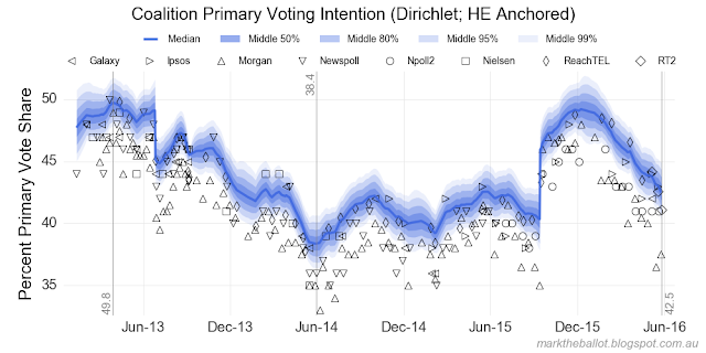
The primary vote polls dramatically underestimated the primary vote share for the Coalition in the lead into the 2013 election. The Green vote was typically over-estimated. This can be seen in the following charts from Model 4.
But this error was off-set by the historically low preference flows (as a percentage, not as a number) to the Coalition at the 2013 election. This can be seen in the following table from Antony Green:
| Greens | Others | |||||
|---|---|---|---|---|---|---|
| Election | % Vote | % ALP | % L/NP | % Vote | % ALP | % L/NP |
| 2004 | 7.2 | 80.8 | 19.2 | 7.2 | 41.7 | 58.3 |
| 2007 | 7.8 | 79.7 | 20.3 | 6.7 | 44.6 | 55.4 |
| 2010 | 11.8 | 78.8 | 21.2 | 6.6 | 41.7 | 58.3 |
| 2013 | 8.7 | 83.0 | 17.0 | 12.4 | 46.7 | 53.3 |
The change in preference flows at the 2013 election means that each pollster's series of two-party preferred estimates contain a discontinuity following the 2013 election. Prior to the 2013 election, this series would have been calculated using (the more generous to the Coalition) 2010 preference flows. Since the 2013 election, they have been using the 2013 preference flows. This discontinuity affects the reliability of the anchored TPP model. It may explain why this series sits lower than the anchored series based on primary votes.
Now the historically low preference flows may be a structural change. The phenomenon of low Coalition preference receipts was repeated in the recent Victorian and Queensland state elections (see this interesting post from Tim Colebatch). So I have kept the 2013 preference flow assumption in my models.
Nonetheless, if we assumed preference flows were to return to 2010 levels, it would add around one percentage point for the Coalition (and subtract one from Labor) in respect of the above estimates. In Model 3, I model preference flows based on the 2010 and 2013 elections.
The final set of challenges comes from unique factors with the 2016 election. While the Palmer phenomenon may have passed, this election looks like it will see a sizable chunk of votes go to the Nick Xenophon Team, particularly in South Australia. How these preferences will flow is anyone's guess. There is no information to inform aggregation models.
So which model do I believe? It may surprise you to know I am skeptical of all models. The four annotated models follow in numerical order:
Model 1 - modeled from TPP estimates, where house effects cancel each other out (sum to zero)
Model 2 - modeled from TPP estimates, with house effects anchored to the 2013 election
Model 3 - modeled from primary vote polls, where house effects cancel each other out (sum to zero)
Model 4 - modeled from primary vote polls, with house effects anchored to the 2013 election


well done, keep it up
ReplyDelete